V&A Dundee
Sewing Box For The Future
Deliverables:
Brand identity
Exhibition graphics and signage
Digital promotional content
Take-home activity cards
Interpretation and feedback materials
My role:
Creative direction
Brand identity
Graphic design
Exhibition design consultation
Artwork and print management
I collaborated with V&A Dundee to develop the identity and exhibition graphics for Sewing Box for the Future, a pop-up exhibition exploring practical ways to reduce fashion waste and extend the life of clothing.
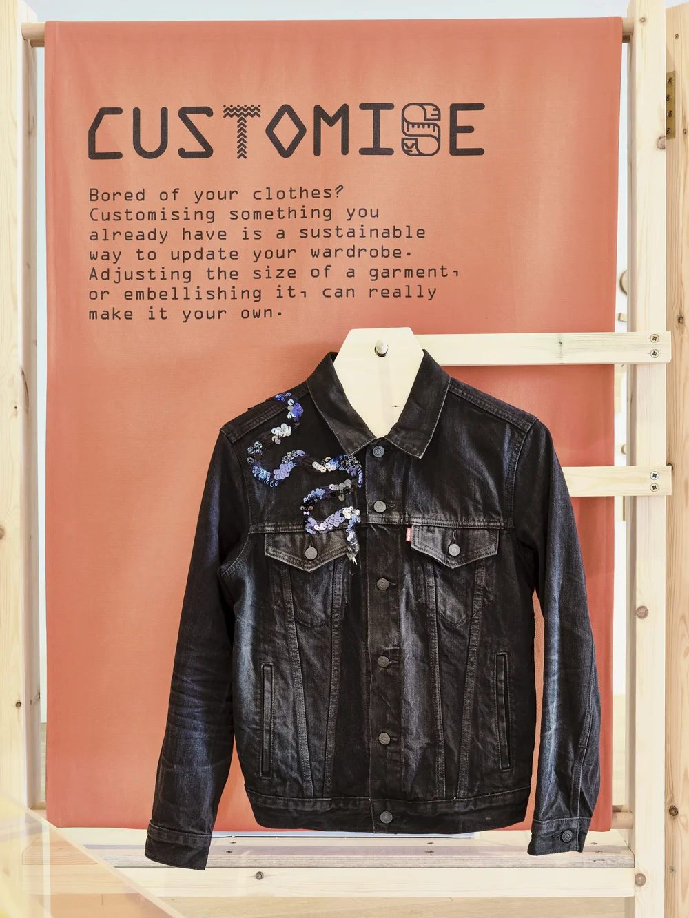
The exhibition introduced visitors to skills ranging from repairing holes and replacing broken zips to understanding care labels and customising existing garments. The challenge was to make these subjects feel accessible, useful and exciting to a broad audience.
Alongside creating the visual identity, I worked with the V&A Dundee team on the layout and visual treatment of the exhibition space, advising on the use of graphics, fixtures and fittings.
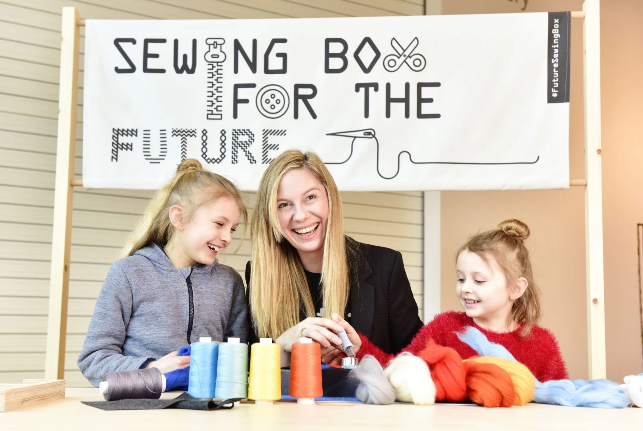

The identity was inspired by the physical and educational tools at the heart of the exhibition: the objects, techniques and knowledge people can use to care for, repair and customise their clothes.
I created a bespoke monospaced typeface for the exhibition logo, which was also used across headings and signage. Selected characters were replaced with sewing tools, symbols and embroidered patterns, giving the typography a playful and distinctive visual language.

The illustration style drew inspiration from the pixelated icons of early Apple computers. Their strict grid structure created a natural connection with embroidery, cross-stitch and digital sewing patterns.
The result was an identity that felt contemporary and energetic without excluding older visitors or people who might already be familiar with traditional sewing and repair techniques.

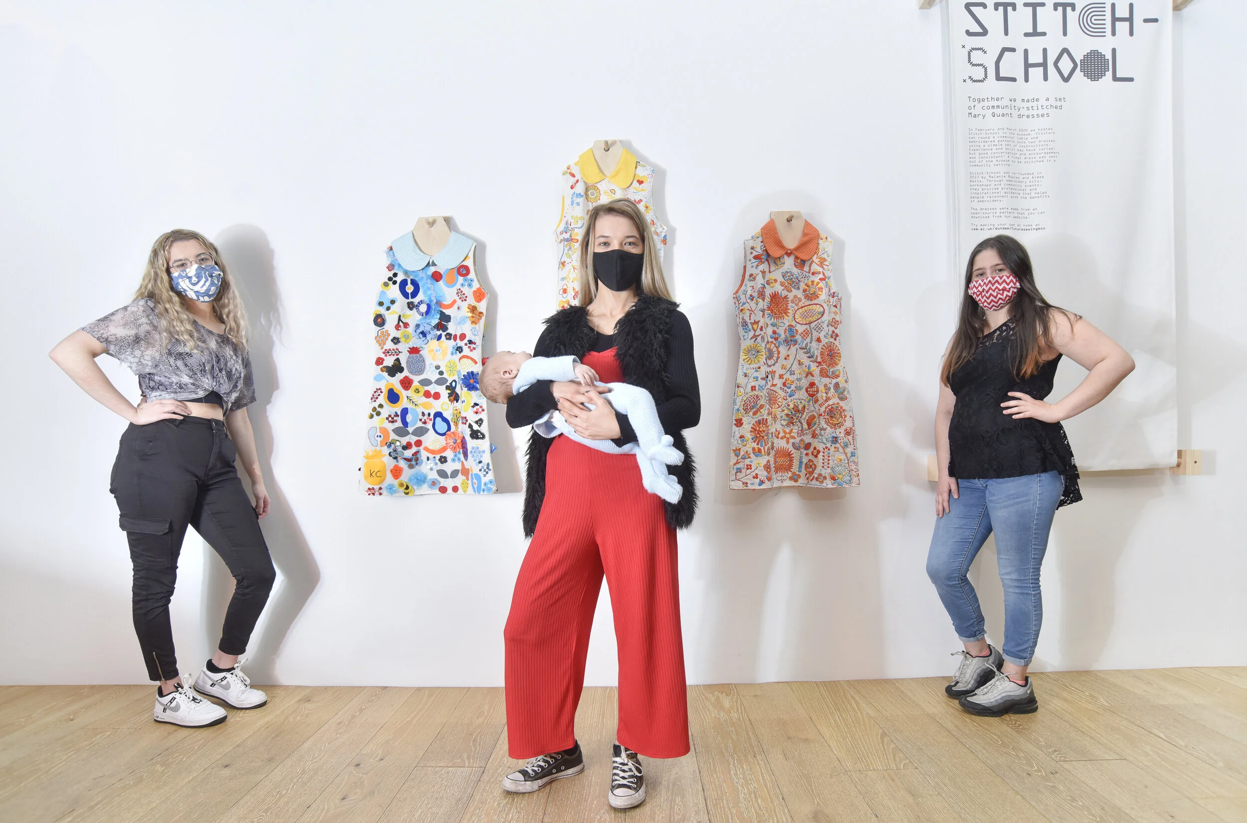


The exhibition was organised around three themes: Care, Repair and Customise.
Each section was given its own colour and symbol, helping visitors understand the layout and navigate between the different activities. The typographic treatment developed for the main identity was extended across the exhibition, with letters replaced by relevant tools, icons and stitch patterns.
This created a flexible visual system that could be used consistently across signage, instructions, activity areas and promotional content.


Visitors were encouraged to continue using the skills they had learned after leaving the exhibition.
I designed a set of 11 take-home activity cards, each explaining a different care, repair or customisation technique. The cards followed a consistent structure while using the identity’s colours, typography and illustrations to make the instructions clear and approachable.
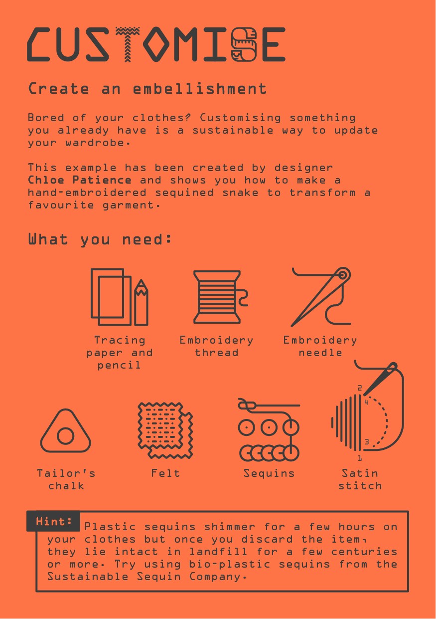


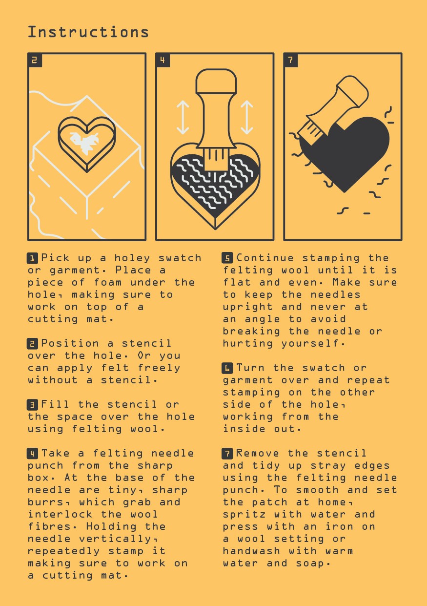


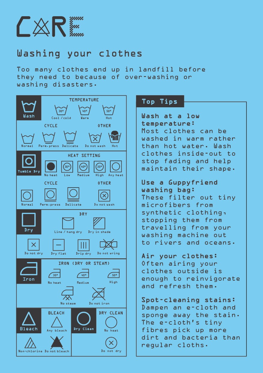


I also created supporting materials including exhibit labels, explanatory graphics and visitor feedback forms, ensuring the identity remained cohesive across every part of the experience.




All work © Gethin Vaughan Schofield 2026