Childline
Counsellor Stats
Deliverables:
13 short social media films
My role:
Creative direction
Project management
Art direction
Music production
Sound design
Childline is a free, confidential support service run by the NSPCC for children and young people under 19. Available 24 hours a day by phone and online, it provides a safe place for young people to talk about any worries or problems.
I was commissioned to create 13 short social media films sharing unexpected facts and statistics about Childline’s counsellors. The aim was to show the people behind the service, making its volunteers feel more relatable and approachable to Childline’s young audience.
Online mini-games were already among the most popular areas of the Childline website. Taking inspiration from their colourful, playful visual language, we developed a series of films that treated each statistic like a moment from a different mini-game.
I led the creative direction and overall production of the series, developing the visual approach and commissioning illustrator Momo to create the artwork.
I then worked with animator Tom Mathieson, directing the movement, timing and transitions to ensure each film felt playful, energetic and consistent as part of the wider series.
Once the animation was complete, I composed original music and created sound effects for each film. Every soundtrack was designed around the individual visuals, helping give each statistic its own character while maintaining a cohesive style across all 13 films.
NSPCC
Parenting Advice
Deliverables:
15 animated social media loops
My role:
Creative direction
Illustration
2D animation
Prop making
Stop motion animation
Editing
Music production
Sound design
The NSPCC is a leading UK children’s charity working to prevent abuse, protect children and support young people and families.
I was commissioned to create 15 short social media loops signposting a range of practical parenting advice. Topics included soothing a crying baby, approaching difficult conversations and finding healthy ways to cope with challenging emotions, such as listening to music or taking part in sport.
Because the advice covered a broad range of subjects and age groups, I used a variety of visual styles and production techniques to give each film its own character. These included clay, fuzzy felt, LEGO bricks, painted wooden props, digital animation and hand-drawn animation.
Despite the variety of techniques, the series needed to feel like one cohesive campaign. I achieved this through a consistent visual language built around simple geometric shapes, a shared colour palette and recurring facial features.
Each animation was designed as a seamless loop, making the content feel natural within social media feeds while allowing the key message to be communicated quickly and clearly.
I also composed the original music and created sound effects for all 15 films, developing an individual audio treatment for each animation while maintaining consistency across the wider series.
Why Co-living?
Campaign Identity and Report Design
Deliverables:
Campaign identity
80-page report for print and digital use
Canva presentation templates
Canva social media templates
My role:
Creative direction
Brand identity
Graphic design
Template design
Print and digital artwork preparation
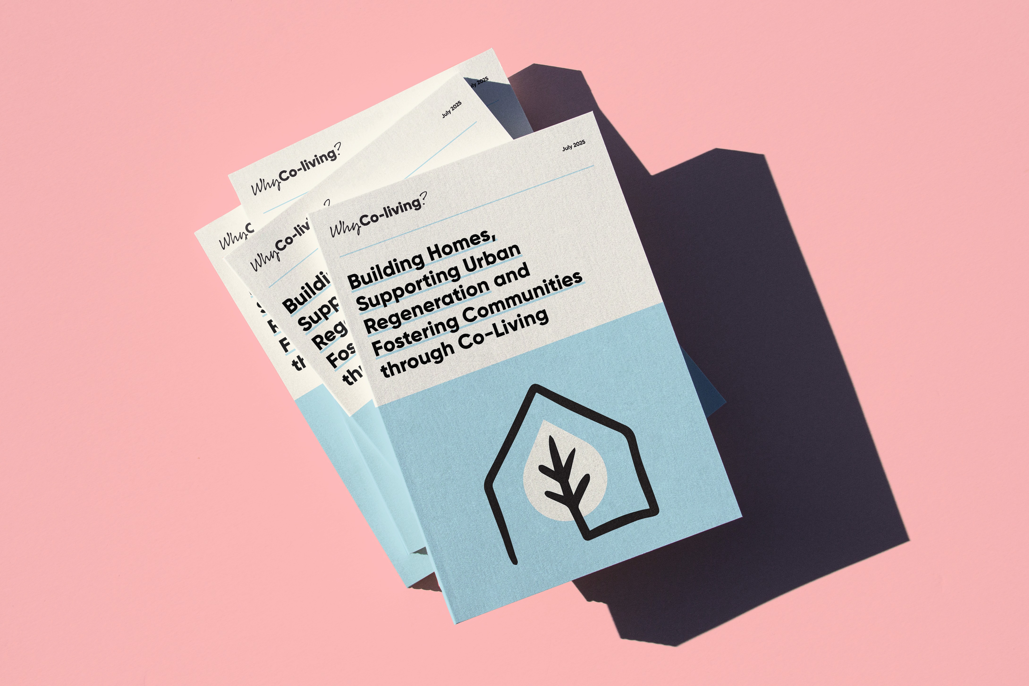
Why Co-living?, also known as WhyCo, is a campaign championing the growth of co-living in the UK. It brings together industry leaders and policymakers to build support, encourage investment and expand the supply of high-quality rental housing.
I developed the campaign’s visual identity, combining hand-drawn elements with bold geometric shapes to create a colourful and approachable brand that still felt credible and professional.
The identity needed to communicate a complex subject to several audiences, including policymakers, investors and professionals working across housing and development. The balance of structured layouts and informal illustration helped make the campaign feel authoritative without becoming overly corporate.
I created a flexible visual system that could be applied consistently across reports, presentations and social media content. This included Canva presentation and social media templates, enabling the in-house team to produce new campaign materials while maintaining the identity’s typography, colour palette and layout principles.
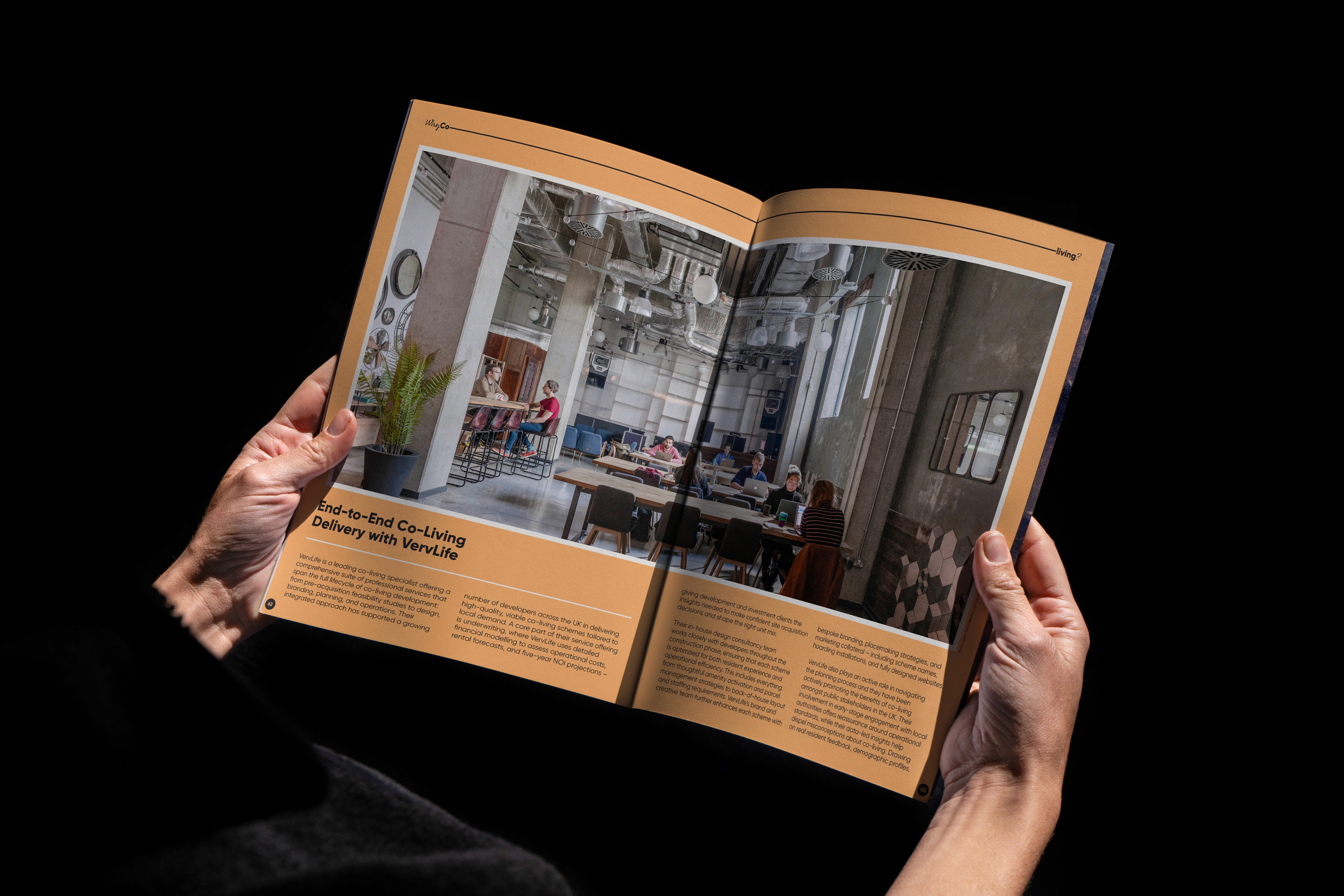
I also designed the campaign’s 80-page industry report, developing a clear editorial structure to organise detailed research, statistics and recommendations.
The report was prepared in two formats: a print-ready version and a digital edition with clickable hyperlinks. Careful attention was given to hierarchy, navigation and consistency, ensuring the document remained clear and easy to use both on screen and in print.


Scouts
Mood Foods
Deliverables:
60-second explainer film
3 editorial illustrations
Step-by-step paper-craft activity guide
My role:
Creative direction
Project management
Design and illustration
Paper-cutting
Stop motion animation
Photography
Editing
Music production
I was commissioned to create an explainer film exploring the science behind the ingredients in a banana, chocolate and Brazil nut porridge recipe - and how each ingredient can affect mood and wellbeing.
The challenge was to communicate the nutritional information in a way that felt clear, entertaining and appropriate for a young audience, without making the film feel overly educational or scientific.
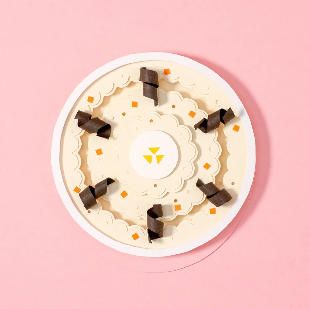
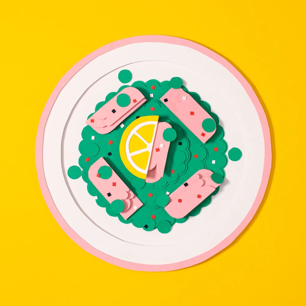
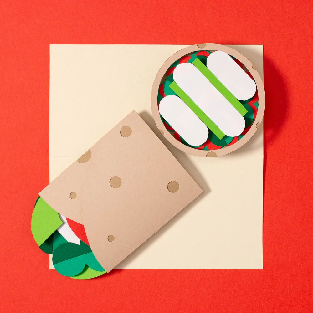
Paper-craft stop-motion scenes formed tactile backdrops for a 2D digitally animated character to explore and interact with. Combining physical sets with digital character animation gave the film a playful, handmade quality while allowing the character to move freely through each scene.
I developed the overall visual approach and designed and illustrated the characters and supporting assets. I then hand-cut, constructed and animated the physical paper elements using stop motion before editing the final 60-second film. I also composed the original music, creating a soundtrack that complemented its upbeat and playful tone.
Alongside the animation, I created three recipe-inspired editorial illustrations for Scouts Magazine. These extended the same visual language into print while presenting the relationship between food, nutrition and mood in a bold and accessible way.
I also designed a step-by-step activity guide showing young people how to create their own paper-craft meal, turning the production technique used in the film into a practical creative activity.

Closomat
Wash & Dry Toilets
Deliverables:
2 long-form films
11 chapter cutdowns
My role:
Creative direction
Project management
Design and illustration
Non-character animation
Editing
Closomat is a British manufacturer specialising in accessible bathroom equipment and the inventor of the modern wash-and-dry toilet.
I produced two long-form films explaining the benefits of Closomat’s products to potential customers, families, carers and healthcare professionals.
Each film was structured in chapters, allowing the content to be divided into 11 shorter standalone films. This gave Closomat a flexible library of content that could be used to answer specific questions, support individual stages of the customer journey and communicate with different audiences.
The challenge was to present detailed and potentially sensitive information in a way that felt clear, engaging and respectful. Accessibility communications in this sector can sometimes feel overly clinical or condescending, so it was important that the films remained positive, human and empowering.
Working from scripts supplied by Closomat, I developed a bold and optimistic illustrative style for the characters. The designs reflected the diversity of the people who use the products, representing different ages, bodies, needs and circumstances without defining anyone solely by their disability.
The bright colours, expressive characters and playful visual details helped make the subject approachable while retaining the clarity and credibility required for customers and healthcare professionals.
I designed and illustrated the films, developed the supporting graphics and animated the non-character elements. I also edited the complete films and their individual chapter cutdowns, ensuring the content worked both as a continuous explanation and as a series of shorter standalone pieces.
Character animation was created by James Horton, with sound design by Llyr Pari.
Donut
Crypto made simple
Deliverables:
4 mixed-media animated loops
My role:
Creative direction
Project management
Illustration
Prop making
2D animation
Editing and compositing
I was approached by ToyFight to collaborate on its branding project for Donut, a cryptocurrency investment app designed to be “so simple to use, a kid could do it.”
Taking this idea as our starting point, we created four playful mixed-media animation loops that explained the app’s key features in a simple and memorable way.
I project-managed a team of eight prop makers, stop-motion animators, 2D animators. Together, we created seven playful plasticine characters inspired by the simplicity and personality of the Mr. Men books, along with a whimsical woodland home influenced by the handmade world of The Magic Roundabout.
The characters, sets and props were constructed from plasticine, paper and wood, giving the films a tactile, nostalgic quality.
Once the physical elements had been captured using stop-motion animation, we added and animated the 2D graphic elements digitally. The final footage was then edited, composited and colour-graded to evoke the warm, slightly imperfect character of a vintage children’s television programme.
Scouts
The science behind Scouts for 'early years'
Deliverables:
60-second animated explainer film
My role:
Creative direction
Project management
Design and illustration
Editing
Music production
In 2019, Scouts began piloting a new programme for four- and five-year-olds - an initiative that would later become Squirrels, its first new age section in 36 years.
The pilot was informed by research into the scientific evidence for early intervention and the benefits of introducing children to Scouts at a younger age. Scouts needed to communicate this detailed research to its members in a way that felt clear, accessible and engaging.
Working from a script developed by Scouts’ in-house team, I created the visual approach for a short 2D animated explainer that translated the key findings into a simple and engaging narrative.
I developed the creative direction and designed and illustrated all the visual elements. The style combined bold, cut-paper-inspired shapes with hand-drawn scribbles, textures and patterns. Playful transitions connected each scene, helping make the research feel approachable without undermining the credibility of the subject.
The film was narrated by a young local Scout, helping it feel connected to the children at the heart of the programme. I edited the final animation and composed the original music, creating a warm and optimistic soundtrack that supported the film’s positive tone.
The finished film helped Scouts explain the thinking behind the early-years pilot and build understanding among existing members before the programme evolved into Squirrels.
Siemens
Keadby2
Deliverables:
Animated educational film
My role:
Creative direction
Project management
Art Direction
Character design
Music production
I was commissioned by Siemens to create a playful educational animation aimed at primary-aged children.
The film was designed to engage communities around Keadby 2 Power Station in Lincolnshire, while encouraging children across the country to take an interest in STEM. It introduced the different sources of energy that work together to power the National Grid, turning a potentially complex subject into something clear, accessible and entertaining.
Working from a script supplied by Siemens, I developed the pacing, tone and visual ideas to make the story more playful and engaging for a young audience. I developed the concept and storyboard, introducing humour, character-led moments and visual surprises so that the film felt entertaining rather than overly educational.
I was responsible for the creative direction, project management and character design. I sourced illustrator Momo and animator Philip Askins, art directing the background illustration and overseeing the animation to ensure the finished film remained consistent with the agreed concept, characters and tone.
I also created the sound effects, using sound design to add personality, reinforce the on-screen action and maintain the film’s pace.
Scouts
The Trailblazing Life of Vera Barclay
Deliverables:
60-second animated biographical film
My role:
Creative direction
Project management
Illustration
Music production
I was commissioned by Scouts to create a short animated film celebrating the extraordinary life and achievements of Vera Barclay for International Women’s Day.
At a time when opportunities for women were severely limited, Vera played a pioneering role in developing the Scout movement. Her remarkable life also included writing more than 40 books, saving lives as a Red Cross nurse and becoming a champion tobogganist.
The film presented this surprising list of accomplishments as a fast-paced visual journey, celebrating both Vera’s contribution to Scouts and her determination to succeed across so many different areas.
Working closely with Scouts’ creative team, I developed a bold, geometric visual style built from simple shapes and distinctive illustrations. I created the storyboard and directed 2D animator Philip Askins, using slick, fluid transitions to connect each achievement and keep the story moving quickly while remaining clear and easy to follow.
The animation was created in just two and a half weeks to coincide with International Women’s Day. I led the creative direction and production, illustrated the visual assets and composed the original score.
The finished film helped Scouts shine a light on an important figure from its history while inspiring a new generation of girls and young women to pursue their own ambitions.
Young
I Didn't Know That series
Deliverables:
3-part animated series
Illustration and motion graphics
Original scripts
My role:
Creative direction
Project management
Script writing
Design and illustration
Music production
I Didn’t Know That about Elton John was the first of three episodes released from the 2D explainer style, animated series I devised, co-wrote and illustrated with Pete Jarvis.
The nonsensical infographic series was created with no real purpose or client, other than to raise a smile and showcase some of Young's slick, motion graphic prowess.
As well as being featured by noteworthy publications such as It’s Nice That, the series was showcased on Will Ferrell’s ’Funny or Die’ and was awarded a Vimeo Staff Pick.
In The City
Festival Branding
Deliverables:
Brand identity
Hero campaign graphic
My role:
Creative direction
Design and illustration
I was commissioned to develop the branding for In the City, a world-renowned music industry festival celebrating emerging talent and exploring the important issues shaping the future of music.
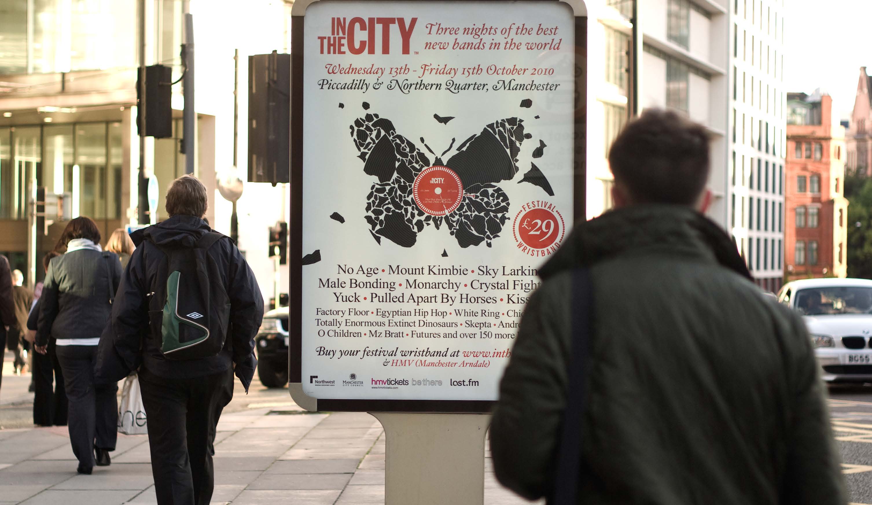
The creative theme focused on the tension between the fragility and resilience of the contemporary music industry. In response, I developed a visual concept that combined ideas of deterioration, disruption and decay with growth, energy and renewal.
The resulting hero graphic captured both sides of the industry’s current climate: the pressures threatening its future and the creativity continuing to push it forward.
This central visual formed the foundation of the festival identity, creating a bold and distinctive campaign that reflected the event’s reputation for championing new music while encouraging debate about the challenges facing the wider industry.


All work © Gethin Vaughan Schofield 2026